Sands Anderson Branding
Established in 1842, Sands Anderson is Richmond’s longest continually operating business, but this growing law firm needed a new logo and visual identity that would differentiate it from competitors. The new brand needed to appeal to the next generation through modern creativity while still leaning on the firm’s history of professional sophistication.
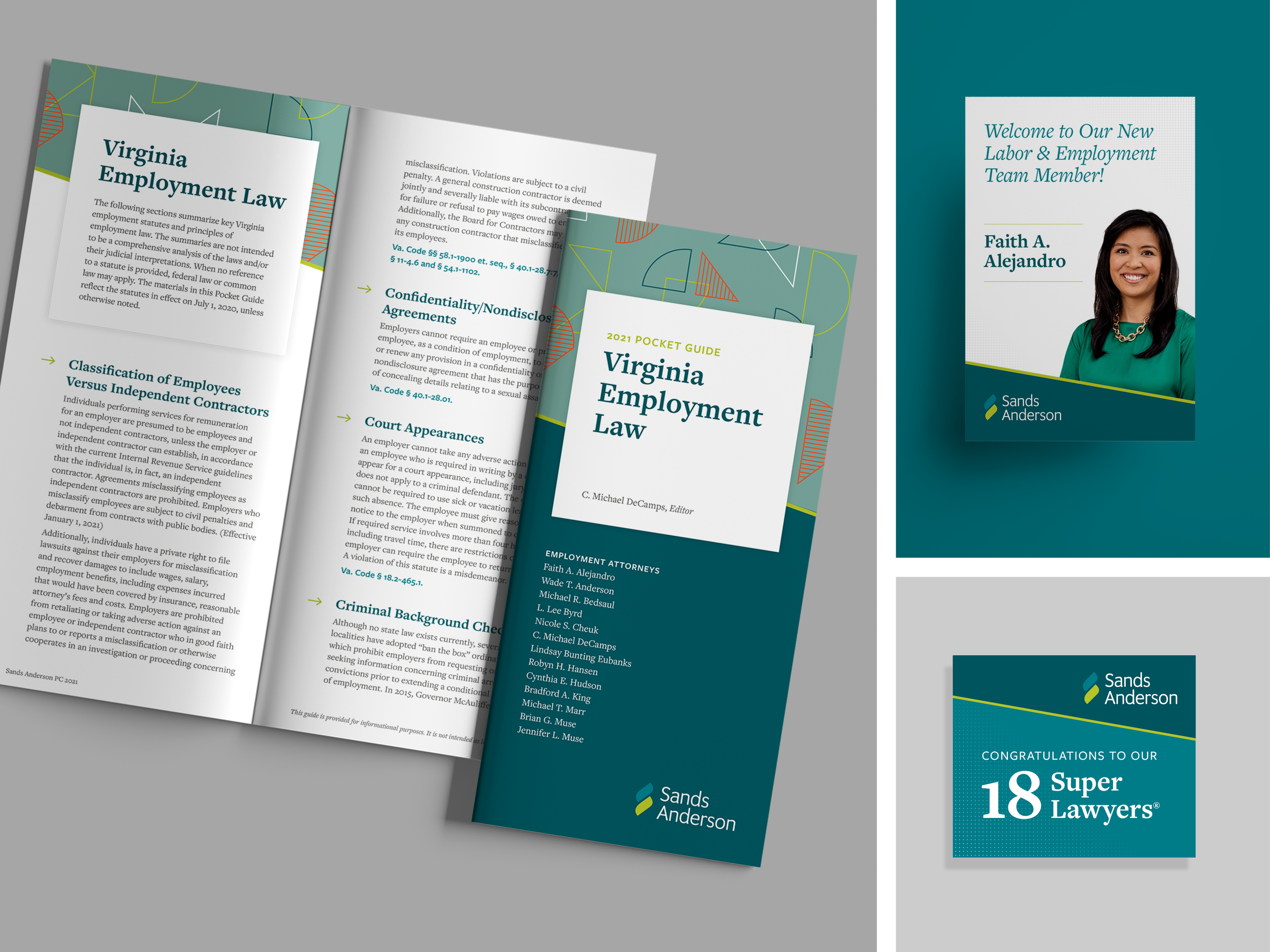
DCH designed a contemporary mark that uses geometric shapes to create an abstract, S-shaped torch, which represents the firm’s forward-thinking legal guidance. Utilizing elements of the firm’s existing color palette, DCH narrowed the focus to teals and lime to give the brand an exciting vibrance. A gradiated pattern of dots adds energy but still feels refined.